
| 导读 | 这篇文章主要为大家介绍了caffe的python接口绘制loss和accuracy曲线示例详解,有需要的朋友可以借鉴参考下,希望能够有所帮助,祝大家多多进步,早日升职加薪 |
引言
使用python接口来运行caffe程序,主要的原因是python非常容易可视化。所以不推荐大家在命令行下面运行python程序。如果非要在命令行下面运行,还不如直接用 c++算了。
推荐使用jupyter notebook,spyder等工具来运行python代码,这样才和它的可视化完美结合起来。
anaconda库
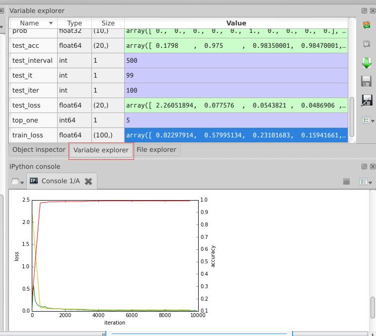
因为我是用anaconda来安装一系列python第三方库的,所以我使用的是spyder,与matlab界面类似的一款编辑器,在运行过程中,可以查看各变量的值,便于理解,如下图:
只要安装了anaconda,运行方式也非常方便,直接在终端输入spyder命令就可以了。
python接口实现
在caffe的训练过程中,我们如果想知道某个阶段的loss值和accuracy值,并用图表画出来,用python接口就对了。
# -*- coding: utf-8 -*-
"""
Created on Tue Jul 19 16:22:22 2016
@author: root
"""
import matplotlib.pyplot as plt
import caffe
caffe.set_device(0)
caffe.set_mode_gpu()
# 使用SGDSolver,即随机梯度下降算法
solver = caffe.SGDSolver('/home/xxx/mnist/solver.prototxt')
# 等价于solver文件中的max_iter,即最大解算次数
niter = 9380
# 每隔100次收集一次数据
display= 100
# 每次测试进行100次解算,10000/100
test_iter = 100
# 每500次训练进行一次测试(100次解算),60000/64
test_interval =938
#初始化
train_loss = zeros(ceil(niter * 1.0 / display))
test_loss = zeros(ceil(niter * 1.0 / test_interval))
test_acc = zeros(ceil(niter * 1.0 / test_interval))
# iteration 0,不计入
solver.step(1)
# 辅助变量
_train_loss = 0; _test_loss = 0; _accuracy = 0
# 进行解算
for it in range(niter):
    # 进行一次解算
    solver.step(1)
    # 每迭代一次,训练batch_size张图片
    _train_loss += solver.net.blobs['SoftmaxWithLoss1'].data
    if it % display == 0:
        # 计算平均train loss
        train_loss[it // display] = _train_loss / display
        _train_loss = 0
    if it % test_interval == 0:
        for test_it in range(test_iter):
            # 进行一次测试
            solver.test_nets[0].forward()
            # 计算test loss
            _test_loss += solver.test_nets[0].blobs['SoftmaxWithLoss1'].data
            # 计算test accuracy
            _accuracy += solver.test_nets[0].blobs['Accuracy1'].data
        # 计算平均test loss
        test_loss[it / test_interval] = _test_loss / test_iter
        # 计算平均test accuracy
        test_acc[it / test_interval] = _accuracy / test_iter
        _test_loss = 0
        _accuracy = 0
# 绘制train loss、test loss和accuracy曲线
print '\nplot the train loss and test accuracy\n'
_, ax1 = plt.subplots()
ax2 = ax1.twinx()
# train loss -> 绿色
ax1.plot(display * arange(len(train_loss)), train_loss, 'g')
# test loss -> 黄色
ax1.plot(test_interval * arange(len(test_loss)), test_loss, 'y')
# test accuracy -> 红色
ax2.plot(test_interval * arange(len(test_acc)), test_acc, 'r')
ax1.set_xlabel('iteration')
ax1.set_ylabel('loss')
ax2.set_ylabel('accuracy')
plt.show()
最后生成的图表在上图中已经显示出来了。
原文来自:https://www.jb51.net/article/253477.htm
本文地址:https://www.linuxprobe.com/caffe-python-accuracy.html编辑:向金平,审核员:逄增宝
Linux命令大全:https://www.linuxcool.com/
Linux系统大全:https://www.linuxdown.com/
红帽认证RHCE考试心得:https://www.rhce.net/